


We practically live behind our mobile devices. We use it for almost everything from good old calling and texting to banking, streaming, and of course, shopping. The real question is, what don’t we use our mobile devices for these days
The internet has become a mobile-first marketplace. There are over 5 billion mobile users worldwide, of which more than 50% of their web traffic comes from online shopping, according to DataReportal. It only makes sense that e-commerce sites are increasingly designed with mobile-first in mind.What is mobile-first design and why is it important?
As the name suggests, mobile-first design is a strategy where designers produce designs fit for mobile viewing, creating better user experiences, which is then modified for desktop use. Previously websites were designed in the opposite order — desktop first and later made to fit mobile. However, things have changed with the rise of smartphones. According to Shopify, mobile accounted for 66% of Black Friday sales on its platform. More people are moving away from sitting behind a computer and towards the convenience of mobile. Considering how lucrative M-commerce can be, it’s no wonder Google is prioritizing mobile-first designs. Google ranks websites based on their mobile versions. To stand a chance of ranking well in Google’s search results, it makes sense to optimize for mobile as much as you can. Not to mention, it’s more profitable in the long run.Mobile-responsive vs. mobile-first design
It’s all about the numbers — and the numbers say: Mobile-first, is content first. With 1 in 4 online searches conducted on smartphones, it’s clear the world is going mobile. However, mobile is a limited platform and preferences should be given to relevant information like vital selling and action points. Simply put, designers should give consumers exactly what they need—nothing more, nothing less.
6 design tips to help you get the ball rolling
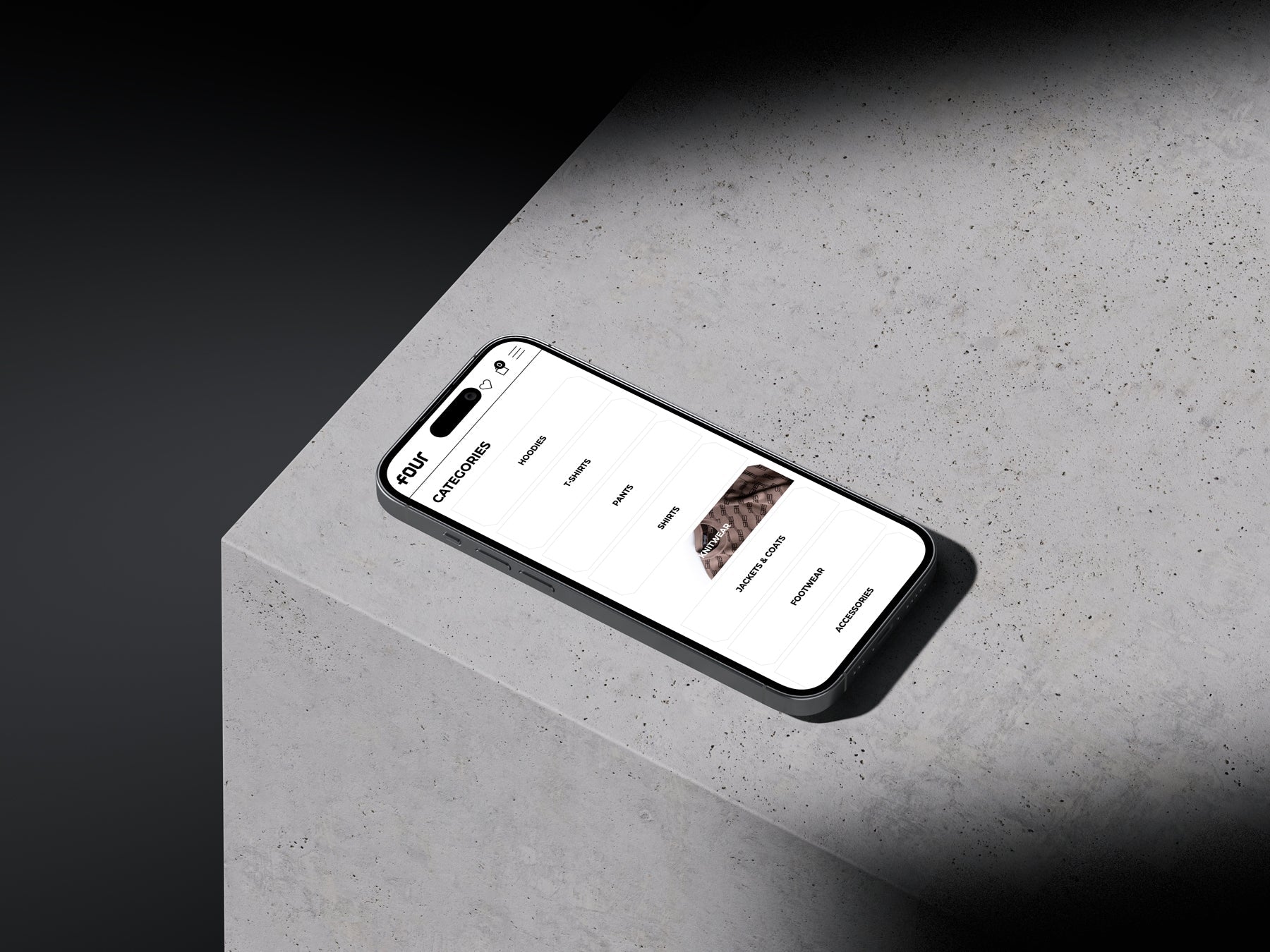
1. Use visual hierarchy
Arrange your content in order of importance. Design your layout so users can easily navigate your webshop, understand and absorb information. Laying out the pieces logically and strategically can help influence and guide users towards favorable outcomes — i.e., different sized elements, large and bright CTA buttons, capitalized heading to draw attention and encourage scrolling. This example from Aimé Leon Dore, does this well using a simple product image against a green background. This draws the user in and invites them to continue scrolling.

2. Less is more
Chuck the junk and keep it simple. These days, people become overwhelmed by vast amounts of information. Avoid long blocks of text or large images. Instead, consider ways to condense your copy to the essential bits or break it up with interactive elements. Shapewear brand, SKIMS, does this well. They’ve taken a minimalistic approach and separate content with images and clickable elements.

3. Tap into clickable elements
Unlike a desktop, where we use a mouse to navigate, we touch our screens with our thumbs and need more screen space. It’s crucial when designing for mobile to make clickable elements large and clear with white space in between to avoid unwanted clicks. For an added element of simplicity, add locating menus and essential buttons at the bottom of your site.
4. Disable the effects
There’s no real benefit or use for scroll effects or hover control without using a mouse. Instead, opt for straightforward ways to showcase this information, like directional messaging or arrows.
5. Speed is vital
especially when it comes to M-commerce. Reducing bandwidth or avoiding large media files and unnecessary code is key. You’ll get to keep the essentials and optimize where you can. And, don’t forget to run and rerun speed tests on your mobile site.
💡Our team of experts built our own Shopify 2.0 theme, containing the best practices we gathered over the years for a speedy Shopify store.
6. Don't be afraid of white space
Are you afraid of the void? Don’t be. It’s a safer bet than a cluttered mobile site. When white space is utilized and well structured, it can help guide users or emphasize elements. Mix in bright, bold colors and interactive graphics to contrast your white space. This will help create a clean and sharp site that’s easy to navigate.
In the end, it’s all about delivering an enjoyable and easy customer journey. With an increasing number of consumers shifting from desktop to mobile, the future of design is a mobile-first design. So, what are you waiting for?